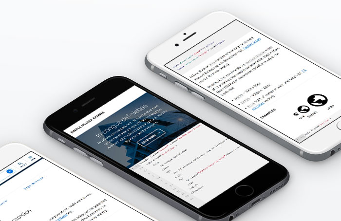
A comprehensive design system and living style guide created for The University of Melbourne to empower teams across the university to plan, design, and build websites and web applications with consistency.
Finally, wrangling 2 million pages into order.

The University of Melbourne's web presence sprawled across over 1,000 websites and more than 2 million pages, managed by largely autonomous business units. Websites were hosted on a range of CMS platforms, each designed and developed by different teams—often at great expense and varying quality. This created a branding nightmare, making it nearly impossible to ensure consistency in usability, navigation, accessibility, or tag management across the domain.

With so many different needs across numerous websites, the only way forward was to take design back to basics. The system was designed to cater to everything from text-heavy student handbook pages to bold, funky marketing campaigns. The focus? Simplicity and flexibility.

Unifying navigation across such a diverse set of sites meant bringing back the hamburger. While controversial, it was the best way to centralise navigation and refocus creators on content. Every user test since has shown that people recognise and use the hamburger frequently—proof that simplicity works.

The university is legally required to ensure full accessibility for everyone, but meeting just the baseline wasn't enough. The design system was built to support all users, regardless of browser or device. Optimising, however, doesn't mean compromising. We support every device and browser but optimise only for the latest (and previous) versions to make room for the newest CSS, JavaScript, and HTML features.

The system currently includes 28 components (and counting) with over 100 variations, making it possible to build almost any website quickly without needing design or development resources. This frees teams to focus solely on producing the best possible content.
All brand assets and university-wide navigation elements (header, footer, sitemap, fonts, styles) are centrally controlled and updated. This allows for seamless rollouts of design iterations, bug fixes, or even major brand changes without any team having to touch their code.
And yes, we were one of the first in Melbourne to make our living style guide public.
♥
