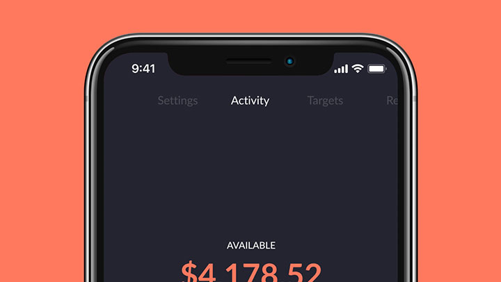
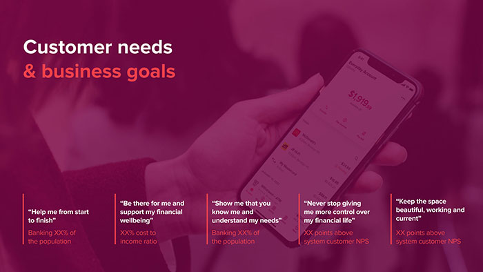
Evolving Bendigo Bank's internet banking app was a lot about taking what worked for Up and tailoring it for Bendigo Bank's unique (and very different to Up's) customer base.
Also to get rid of the 90s look.

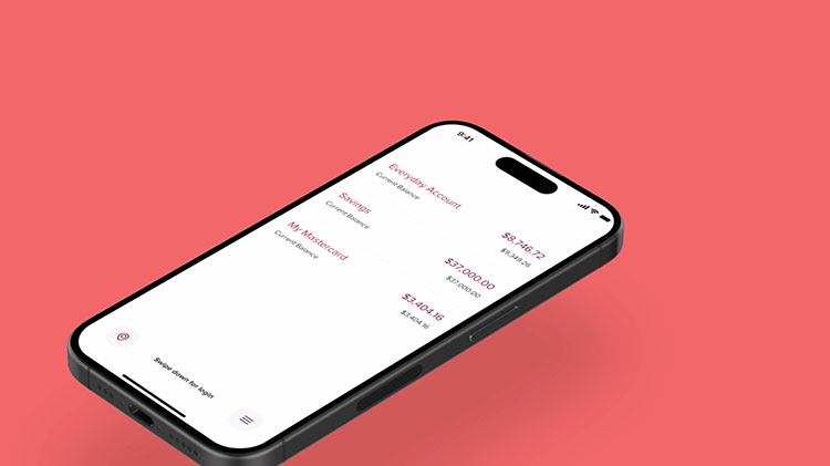
Showing only one balance at a time makes it easier to understand your finances at a glance, while still letting customers choose which balance they prefer to view
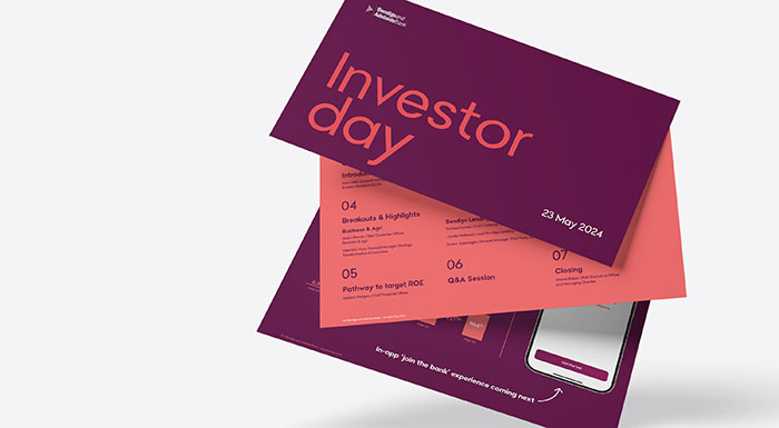
Increasing new customer sign-ups by offering a fully digital, seamless experience that allows you to become a customer faster than ordering and drinking your flat white.

In anticipation of potential negative feedback, we planned to introduce the new design gradually to our change-resistant user base. Instead of a big bang rollout, we opted for implementing small, incremental updates over time, allowing users to adapt more comfortably and ensuring a smoother transition to the new design.
Evolution instead of revolution.
The new designs sparked a completely new app strategy, but due to technological limitations, building on the existing app wasn't feasible. Instead, the designs now form the foundation for a brand-new app, currently in development, utilizing Up's technology.
♥
